Designing a house in Kerala has its particular challenges and possibilities of its own. A proper colour scheme can very easily change your place in case it overflows with daylight, is surrounded by nature and has a hot and humid climate. Soft colour palettes, especially those derived from nature, minimalism, and the use of sea colours, fit nicely into Kerala houses and make them tranquil, stylish, and a reflection of contemporary lifestyle.
This blog features the 7 best soft colour palettes for home interiors in Kerala, designed to enhance your space while harmonising with the state’s architectural style. If you were to renovate your house or build a new one, these Home Interior Colour Palettes would be the perfect point to begin.
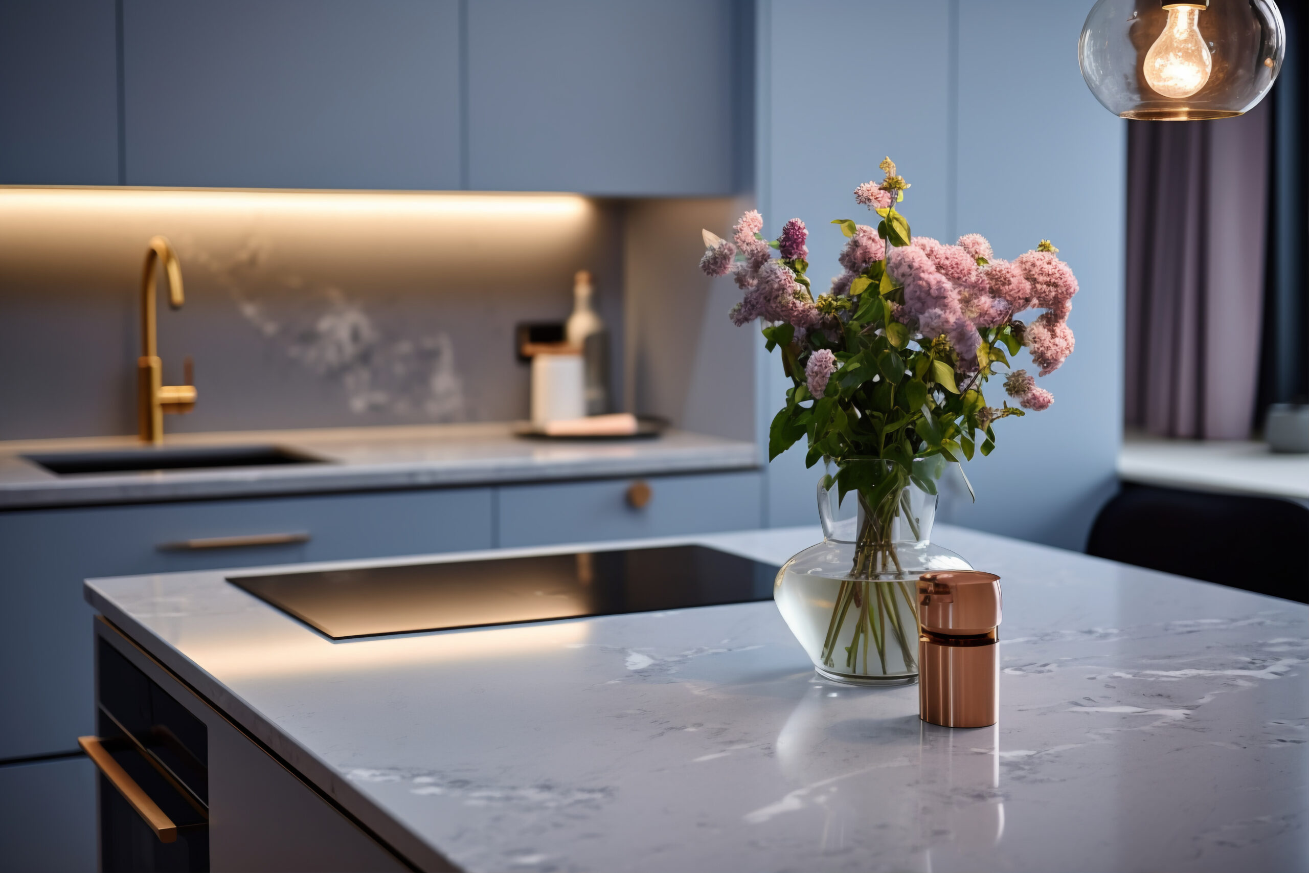
Being a beachside place with lots of fresh air, Kerala has made pale blues one of the top picks for contemporary houses. A pastel blue combined with a dusty grey very quickly gives off a cool, sea-inspired vibe to the room.
Why is it effective in Kerala?
Where to use:
Good match with:
Furniture made of white oak, décor made of cane, and indoor plants.
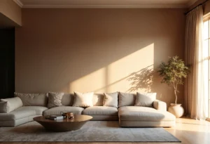
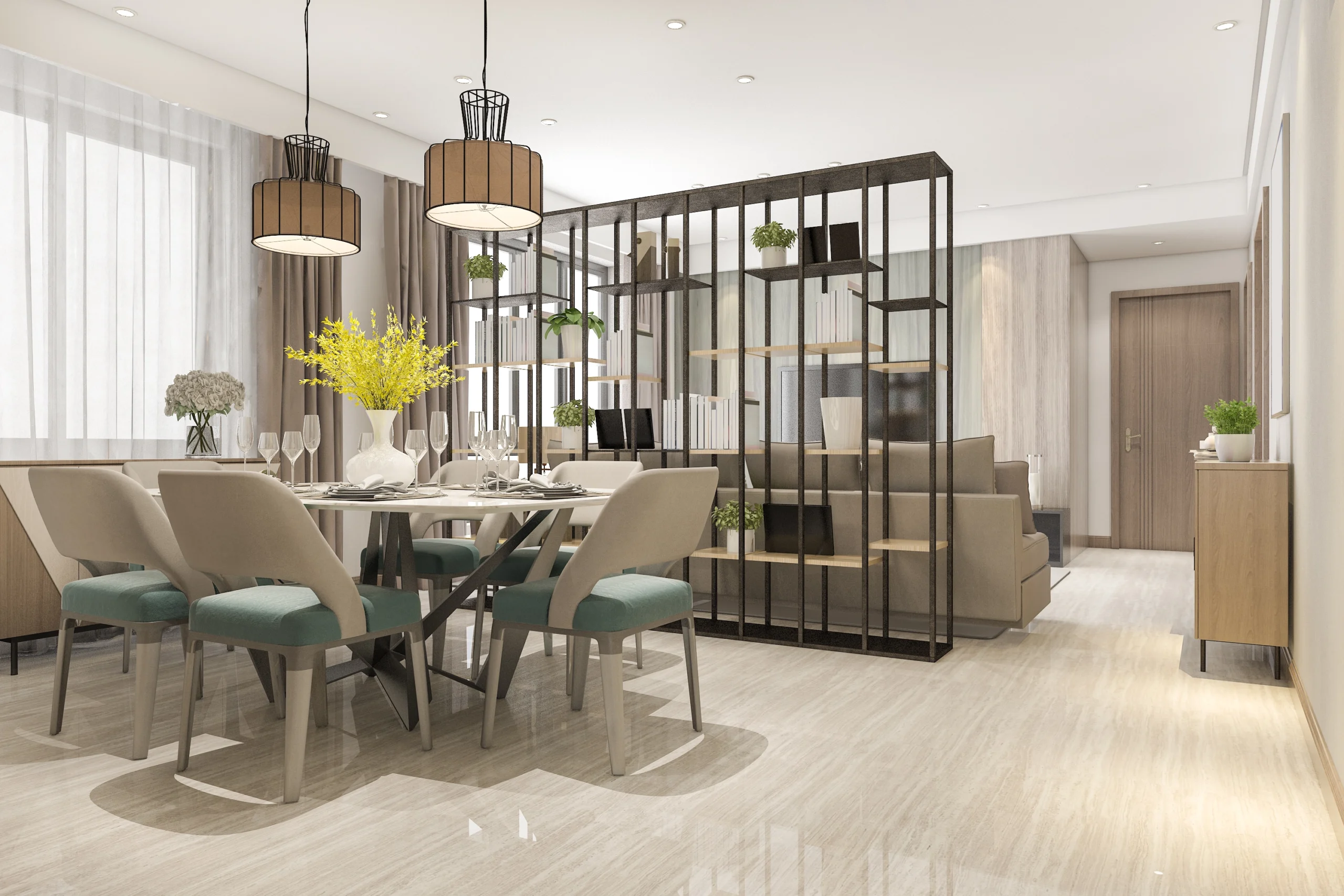
This color scheme has been a favorite of Kerala families for a long time. Beige is the element that renews the space with warmth, while ivory is the one that keeps the room airy and light.
Why it works in Kerala:
Where to use:
Pairs well with:
Teakwood furniture, brass décor, jute rugs, and authentic Kerala art.
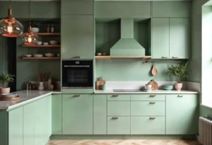
Soft green shades such as sage are gaining a lot of popularity in Kerala mainly because of their calming effect and their feature of mirroring the green outdoor.
Reasons it functions well in Kerala:
Usage Ideas:
Good combinations:
Matte black hardware, stone surfaces, and rattan furniture.
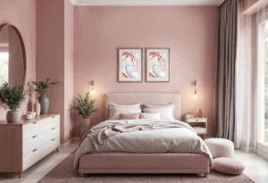
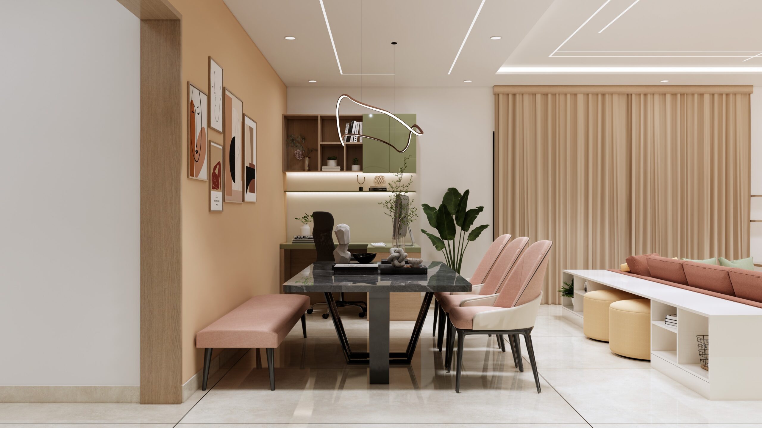
Pink blush forever remains a sweet, gentle and lovely element of a design but not when goes alongside a mushroom-grey. This color combination is ideal for modern homes in Kerala.
Reasons to use it in Kerala:
Usage:
Compatible with:
Rose-gold light fixtures, pale wood, and minimalist decor.
If you think of a trendy house that would still look grounded, earth tones like sand brown would be just great. The colors are inspired by the nature of Kerala that includes beaches, terracotta tiles, and the soil.
Why it works in Kerala:
Where to use:
Combinations with this color:
Terracotta décor, wicker accessories, beige curtains
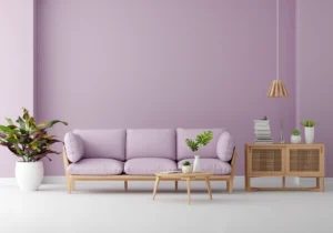
Lavender is a colour scheme that is often overlooked for the house interior, and it actually goes quite well with Kerala when soft, muted tones are used.
Reasons for its effectiveness in Kerala:
Implementation:
Combinations:
Silver accents, glass elements, white furniture.
The pairing of these two color materials visualizes the modern minimalist style trend which is going to be popular in the Kerala homes in the near future. Powder blue is a great space fixer for a relaxed vibe, whereas natural wood is perfect for adding warmth and a little contrast.
Why it works in Kerala:
Where to use:
Pairs well with:
Indoor plants, white ceramics, textured rugs.
Deciding on the perfect color palettes for your home interior goes far beyond just the visual aspects. Here are some wise tips to help you choose the right one:
A house that is flooded with the sun can be painted in cold colours such as blue, green and lavender with excellent results. For spaces that lack light, it is advisable to use warm colours like beige, sand, or blush.
If your Kerala furniture is made of traditional wood (teak, rosewood), go for warm neutrals. Pastel colours and greys will be ideal if you have modern furniture.
It is better to pick colours that will still be fashionable years from now and not just trendy shades that will become obsolete quickly.
Choosing one main colour and two accent colours and using them throughout the house will give you a consistent and classy result.
Apply paints in small patches on the wall and ‘test’ them at different times (morning, noon and evening) to see how the light affects the colors.
The colour palettes for Kerala homes need to be those that reflect not only the beauty but also the comfort. Soft, muted colours are just right—they keep your interiors cool, trendy, and strongly
linked with the natural coarseness of Kerala.
Regardless of whether you are a fan of the ocean blues, the earth browns, or the classy pastels; a proper Colour Palette for Home Interior has the power to change your room entirely. The main thing is to pick colours that are compatible with your light, architecture, furniture, and general way of life.
for a free consultation, and let’s start designing your dream home interiors in Trivandrum.
 Explore our projects: BuildArt on YouTube